The Map page of the review dialog is divided into three sections: a preview map featuring a graphical representation of the compiled survey data, a Preview Map control panel for controlling the region displayed, and a set of Displayed or Printed Map controls. The latter are used to generate more detailed maps, with station labels and segment-defined colors and line styles, in separate screen windows. Also, when any page of the review dialog is active, the Print, Print Preview, and Export Map as Metafile options are enabled in the program's File menu, allowing you to print or export maps similar to those that are displayed. (The Page Layout page is best for launching print jobs, however.)
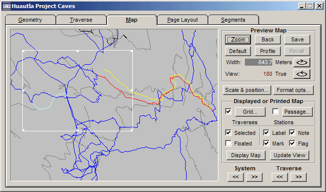
Preview Map
The preview map highlights the physical features selected via the Geometry page and therefore has a central role to play in data screening as well as in generating final output. Vectors contained in loop systems (if not the selected system) are colored black instead of gray; the selected loop system is colored blue; the selected traverse is colored red. If the selected traverse has been floated, the unadjusted version is colored yellow. If the selected traverse is part of a traverse chain, the remaining traverses in the chain are colored light blue.
Coordinates or distances: When the mouse pointer is inside the preview map window it will have one of two shapes. If the measure tool is enabled, the cursor will be a small icon consisting of a tiny cross above a white ruler. Otherwise the cursor is a large cross. The measure tool is toggled on and off via a menu choice (View | Measure distance) or more conveniently by selecting a toolbar button with the same ruler icon. When the tool is enabled, left-dragging the mouse will draw a line "rubber band" style on the map, causing the corresponding distance and azimuth to appear on the Walls status bar in place of the coordinates that are normally displayed. (Displayed maps also have this feature.)
Operations on the preview map usually involve a tracker rectangle, which outlines a region for a zoom operation or for generating a displayed or printed map. When the measure tool is not active, you create a tracker rectangle by left-clicking on one corner of the desired region, dragging the mouse pointer while holding down the left button, and releasing the button when the desired size is attained. The result is a hollow white rectangle that can be resized by dragging one of the eight "sizing handles". It can also be repositioned by left-clicking on the interior and dragging it to a new location. The rectangle is removed by left-clicking anywhere outside its boundary.
Another way to create a tracker rectangle is via a station search operation. By clicking the binocular icon on the toolbar (or by invoking Search/Find... on the menu) you will open a dialog that prompts for a station name. If the name of an existing station is entered and the dialog is closed, the view is shifted (if necessary) and a small tracker rectangle is centered about the station. If the right-arrow icon on the toolbar is clicked instead, the rectangle is centered on the previously searched-for station (or the network component's reference station if this is the first search operation).
Normally the width of the view in survey units (feet or meters) is displayed in red and labeled "Width:" in the control panel. However, when a tracker rectangle is in place, the rectangle's width is displayed in white instead.
Apart from the preview map controls, which are described below, several mouse shortcuts are available for changing the view or displaying statistics:
| • | Left-dragging opens a tracker rectangle (described above) unless the measure tool is enabled, in which case a line is drawn and its length and azimuth are displayed on the status bar. You can toggle the measure tool on and off with either a toolbar button or a right-click context menu selection. When this tool is active, the cursor is a tiny white ruler instead of a cross. |
| • | Left double-clicking within a tracker rectangle zooms to the view that is outlined. The same result is achieved by clicking the Zoom button when a rectangle is present. |
| • | Left-click and drag with the CTRL key down to pan across the image (scale is not changed). |
| • | Right-click and drag (side-to-side) with the CTRL key down to rotate the image in 1-degree increments about a vertical axis. The axis of rotation is at the image's center for plan views and at the component's reference station for profile views. |
| • | Left double-clicking anywhere but inside a tracker rectangle centers the view over the specified point without changing the scale. |
| • | Right clicking anywhere in the frame opens a context menu with options for zooming and panning the view. Additional options are toggling the attachment end of a floated traverse and toggling the measure tool on or off . |
The vectors connecting #FIXed stations to the zero reference are not drawn as such on the preview map. Instead they are represented by tiny squares centered on their respective stations. The color scheme used for vectors, which identifies the selected system and traverse, is also used for the squares. On the lower right of the Map page are two pairs of scroll buttons, << and >>, which can be used to change the "System" and "Traverse" selections in a circular fashion.
Also useful during data screening is the connection toggle, a special toolbar button (the one labeled with a red and yellow diagram) that toggles between attaching one end or the other of the unadjusted (yellow) version of a floated traverse.
Preview Map Controls
The "Preview Map" section of the control panel contains buttons for setting position, orientation, and scale. While these settings immediately affect the preview map, they also define the region that will be viewed in "Display" map windows and in printed maps.
Zoom: If a tracker rectangle is present, clicking this button causes the region enclosed by the rectangle to fill the view. Otherwise, the effect depends on the status of the Trav check box (in the Displayed or Printed Map section below). If Trav is checked, the map is scaled and repositioned so that the selected (red) traverse occupies most of the frame -- the same action invoked by the Zoom button on the Geometry page. If Trav is unchecked, the scale is increased by 50% while maintaining the center position.
Back: This operation "backs up" to a view from which you've previously zoomed, assuming there is one. (The program keeps track of the sequence of zoom operations.) If there is no such prior view, the scale is reduced by one third. In each case, the result is a new tracker rectangle showing the region you've just backed from, provided it's still visible.
Default: When the preview map of newly-compiled survey data is displayed for the first time (unless you've zoomed to a traverse) the selected network component is shown in plan view, with north either straight up (0 degree view) or to the left (90 degree view). A convenient scale is automatically chosen. The corresponding default profile is similar except that the view direction is now defined as "into the screen" instead of "up the screen". At any time you can restore this view (plan or profile) by clicking the Default button. This also enables a Walls menu item, View/Flip default view, which rotates the default view 180 degrees. Whether or not the default view is so rotated is a preference setting that's preserved for subsequent review sessions.
Profile/Plan: Clicking the button labeled "Profile" or "Plan" causes the orientation to change, respectively, from plan to profile or profile to plan. While this action preserves the view direction, the center location and scale will normally change to that of the default view to insure that at least part of the network remains visible. The exception is when the Trav check box is checked. In this case, clicking Profile/Plan will change orientation while simultaneously zooming to the selected traverse.
Save and Recall: Clicking the Save button takes a "snapshot" of the current overall view (not the tracker rectangle). The center coordinates, orientation, and exact frame width in survey units are saved in the project item's database. At a later time, possibly in a different Walls session, the saved view can be reinstated with a click of the Recall button. Separate snapshots for plan and profile are maintained. You'll notice that both buttons will be disabled (grayed) whenever the snapshot is actually visible. In other words, clicking either button will turn both buttons gray. Thereafter, any sort of change, such as zooming or panning, will enable the buttons. If you leave a review session with the saved view visible (buttons grayed), this same view, plan or profile, will be reinstated the next time the project item is reviewed. However, if you recompile the item, a new default view will instead be computed and made visible. In this case, the original saved view can still be recalled. Views established with the Locate dialog (see below) are automatically saved depending on an option setting in that dialog.
Scale & Position: This button (also on the Page Layout page) invokes the Scale and Position dialog that allows for more precise scaling and positioning of the view. Normally, you will invoke this dialog prior to printing a final map, or when exporting a metafile.
Format opts: This button provides quick access to the Map Format Options dialogs, which are also available from the menu bar. Be sure to use the Printer/Screen button on those dialogs to toggle to the set of options you are interested in. These options are not project specific (mostly default settings) and will be preserved between program invocations.
Rotate Buttons: Two buttons, marked with curved arrows, are available for quickly rotating the map about a vertical axis in 15-degree increments, either clockwise or counter-clockwise. For plans the axis of rotation passes through the center of the image. For profiles, the axis passes through the component's reference station. The resulting view direction (defined as up for plans and into the screen for profiles) is labeled "View:" and displayed just to the left of these buttons. The Locate dialog must be used for more precise changes of view direction. Alternatively, the CTRL-right-drag mouse shortcut can rotate in increments as small as one degree.
Displayed or Printed Map Controls
The preview map is used for data screening and for navigating to specific regions of interest at a desired scale and orientation. Beyond that you have little control over what is displayed. The customizable maps are generated with the controls in the "Displayed or Printed Map" section of the Map page, which are described below. For anything fancier than default colored maps with grids and station labeling, you'll also need to work with the Segments page, which allows you to assign different map attributes to different portions of the data.
In addition to the various settings described here and in the Segments page, there are a number of style preferences that you will need to change less frequently: fonts for annotation and labels, frame dimensions and line thickness, tick mark and station marker styles, label offsets and spacing, etc. These preferences are set in the Options | Printed maps... and Options | Displayed maps... dialogs, which are most conveniently accessed via the Options... button (see below). They are not specific to the compiled project branch, but apply to all projects you work with. For a description of the dialogs see Map Format Options.
| • | Grid: The check box enables (or disables) display of a rectangular grid. When a item is compiled for the first time, the grid is initially turned off. At the end of a review session, the grid's on/off status is preserved in the workfiles for that item, along with the grid's properties. The button labeled "Grid" opens the Grid Intervals dialog, which allows you to specify grid properties such as origin, spacing, and orientation. The color and style of grid lines are specified on the Segments page. |
| • | Passage: The check box enables (or disables) display of passage dimension data, either LRUD measurements or the mask layer of an attached SVG file. The button labeled "Passage" opens the Passage Display Options dialog, which allows you to choose options related to passage drawing. The Segments page has controls for setting floor color and passage outline style. |
| • | Stations - Mark and Label: These check boxes enable/disable station marking and name labeling for both displayed and printed maps (not the preview map). Note that when a feature is turned on, the selective disabling of this feature for different parts of the segment tree is possible via the Segments page. When it is turned off, the corresponding segment assignments are ignored; the feature will be absent. |
| • | Stations - Flag: This check box enables (or disables) marking with a prominent symbol those stations specified with #FLAG directives in data files. This symbol, the size and shape of which are selectable Map Format options, will override the usual marking symbol (a plus sign) if station marking is also enabled. |
| • | Stations - Note: This check box enables (or disables) the display of any annotation you've attached to stations via #NOTE directives in data files. The position of the text with respect to the station is the same as that of a label and is an adjustable Map Format option. (An assigned note will override a name label.) Also selectable is the font used for the text. |
| • | Traverses - Selected: Checking this box has two consequences. First, the selected traverse will appear on displayed and printed maps with the line style and color assigned to its corresponding node in the segment tree. (On the Segments page this node is labeled "Selected Traverse". One level beneath it is a node for the unadjusted version, which is displayed only if the traverse is floated.) Second, the actions of the Zoom and Plan/Profile buttons are modified when the Selected button is checked. Both will cause the preview map to home to the traverse, as described earlier. NOTE: This option causes the selected traverse to be displayed or printed, even if the vectors would otherwise be excluded from the map due to the detachment of segment tree branches. As a result, you could conceivably have the traverse displayed by itself in the middle of a blank area. |
| • | Traverses - Floated: Checking this box enables highlighting of all floated traverses on displayed and printed maps, while at the same time removing any special highlighting of the selected traverse (see above). You can then produce a map where it can be seen at a glance where your floated traverses are. If you check this box and switch to the Segments page, you'll see that the "Selected Traverse" node has been renamed "Floated Traverses". Line style and color attributes can then be chosen for the set of floated traverses as a whole. Unlike a highlighted selected traverse, the floated traverses (or portions thereof) will appear on maps only if their vectors haven't been excluded via detachment of segment tree branches. By choosing appropriate line styles, you can display the unadjusted versions (one end detached), the adjusted (floated) versions, or both versions. To specify the ends of attachment for the unadjusted versions, you can select each floated traverse in turn and use the connection toggle as necessary. |
| • | Display Map: Clicking this button generates a separate map window that remains a component of the Walls desktop until it is specifically closed, or until the project window is closed. The region that's currently visible in the preview map is what's initially shown unless a tracker rectangle is present. In the latter case, the tracker rectangle defines the region. The initial visibility of station markers, names, flags, and notes are controlled by the above mentioned check boxes, while map attributes such as background color, station marker and label color, line styles and colors for vectors and grid, etc., are determined by settings in the Segments page. (The default color settings are black background, light blue vectors, gray grid lines, and white markers and annotation.) The visibility and appearance of individual survey segments can also be controlled via the Segments page. See Displayed Maps. |
| • | Update View: Clicking this button changes only the region displayed in the most recently created map window. This is an alternative to panning and zooming the map using mouse operations. The elements displayed on the map should not change, as most of these are controlled via the map's context menu. By contrast, repeated use of the Display Map button produces multiple map versions that can be displayed together, such as plan and profile. |